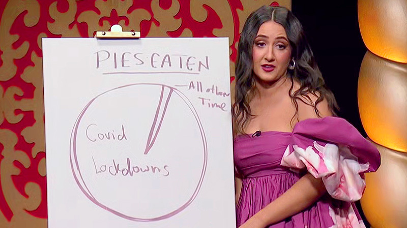
Concetta describes a pie chart about pies
Concetta draws a line graph, and then has to describe Rhys’ pie chart.
She says that the chart is both vulnerable and clear, and shows the amount of pies she has eaten and when she ate them. She says the majority of pies, probably 90%, were eaten during Covid lockdowns, and that the other 10% were eaten during all other times.
Tom Gleeson says that her explanation was good but simple, so Concetta earns 2 points.
(Written by JoGo and proofread by Karl Craven)
(Illustrations collected by JoGo and adjusted by David Fuller)